
The Psychology of Colour: Choosing the Perfect Paint Shades for Every Room
Transforming a house into a personalized sanctuary requires thoughtful colour selection that resonates with both the architecture and the inhabitants’ emotional needs. When homeowners partner with experienced residential house painters for their projects, they gain access to valuable insights about how different hues affect mood and perception. These certified house painters bring not only technical expertise but also an understanding of colour psychology that helps create spaces that feel instinctively right. The difference between a room that simply looks acceptable and one that feels genuinely harmonious often comes down to subtle colour distinctions that trained eyes can identify, helping to create living environments that support wellbeing while expressing personal style.
Beyond Beige: How Colour Shapes Experience
The walls that surround us do far more than simply define physical boundaries—they create psychological environments that influence everything from sleep quality to conversation flow. This invisible influence operates constantly below our conscious awareness, shaping daily experiences in profound ways.
Colour selection impacts spatial perception in ways that can solve architectural challenges. A long, narrow hallway painted in a slightly lighter shade at the far end appears more proportional, while low ceilings seem higher when finished in luminous tones that reflect light upward. These optical illusions create balance that structural changes can’t achieve alone.
The emotional impact varies dramatically between seemingly similar shades. What appears as “just blue” actually encompasses endless variations that trigger vastly different responses. A blue with subtle grey undertones creates serene sophistication perfect for home offices, while blues leaning toward turquoise energize creative thinking in studio spaces. These distinctions matter tremendously for functional satisfaction.
Temperature perception also shifts with wall colour. North-facing rooms with limited natural light often feel physically colder when painted in cool tones, regardless of the actual thermostat setting. Conversely, warm terracotta or gentle amber hues can make spaces feel cosier without adjusting the heating—a particularly valuable benefit during Canadian winters when warmth becomes psychologically precious.
Colour Zoning: Creating Functional Harmony Throughout the Home
Modern homes serve multiple functions that sometimes conflict: productivity versus relaxation, energetic socialization versus peaceful retreat. Strategic colour selection helps establish these different zones without requiring structural separation.
Kitchen colours can support both functionality and appetite in unexpected ways. The conventional wisdom suggesting bright reds and oranges stimulate hunger actually proves problematic for many eating spaces. These highly saturated tones can increase stress hormones and promote faster eating—potentially undermining mindful nutrition. Instead, balanced mid-tones like sage green or buttercream create environments where both food preparation and enjoyment happen without physiological pressure.
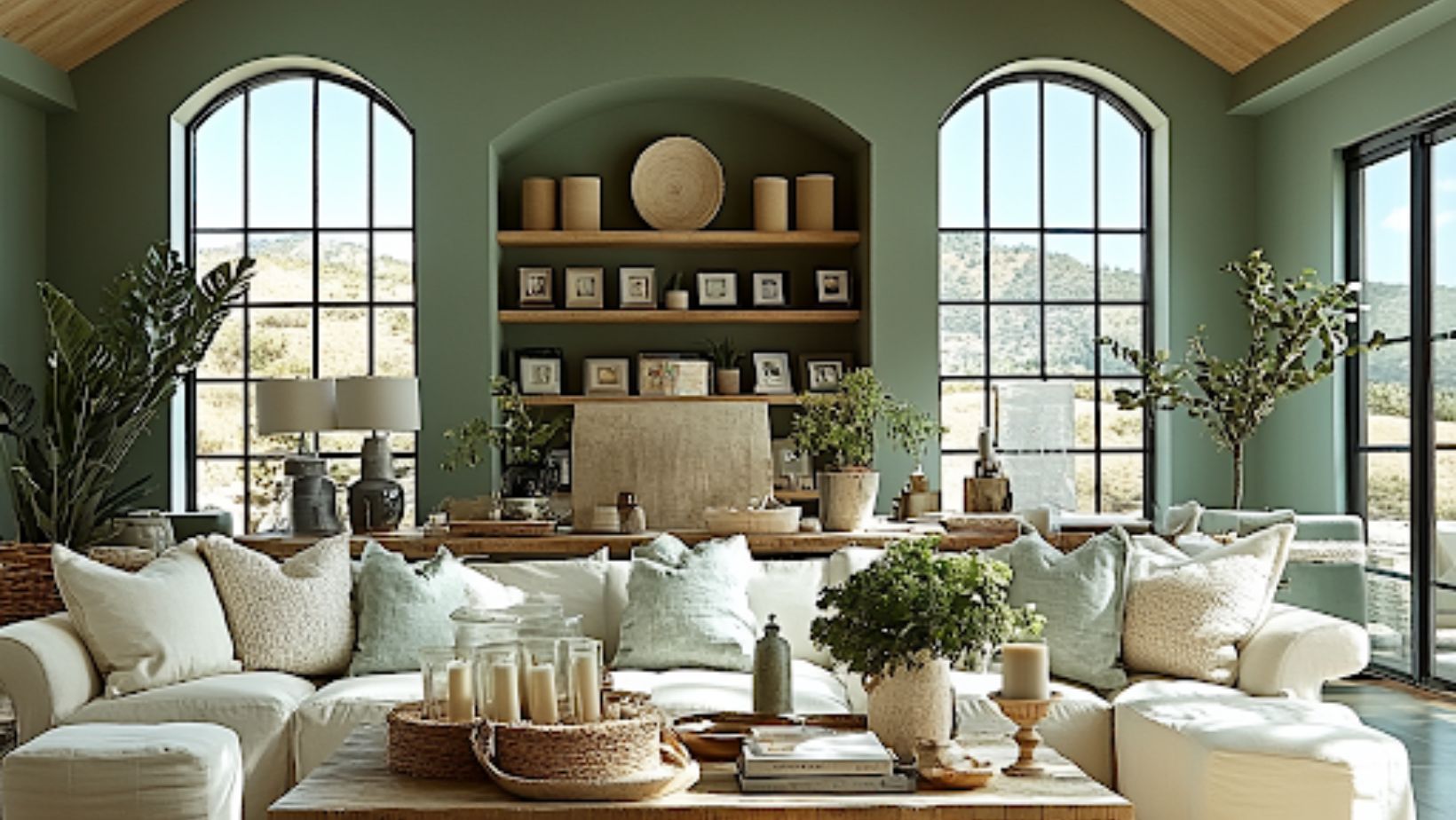
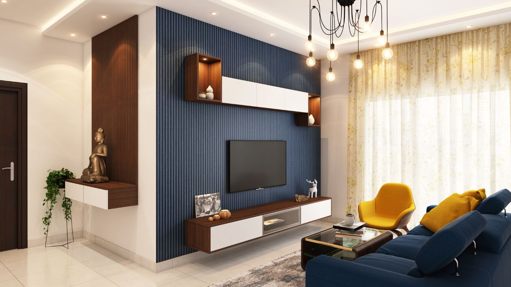
Living room colour selection depends entirely on the space’s primary function. Rooms intended primarily for conversation benefit from warm, moderate tones that encourage verbal exchange without overwhelming the senses. Muted terracotta, gentle wheat, or soft coral create backgrounds that support human connection by providing interest without competition. Conversely, media-focused living spaces function better with deeper, cooler tones that reduce eye strain during screen time.
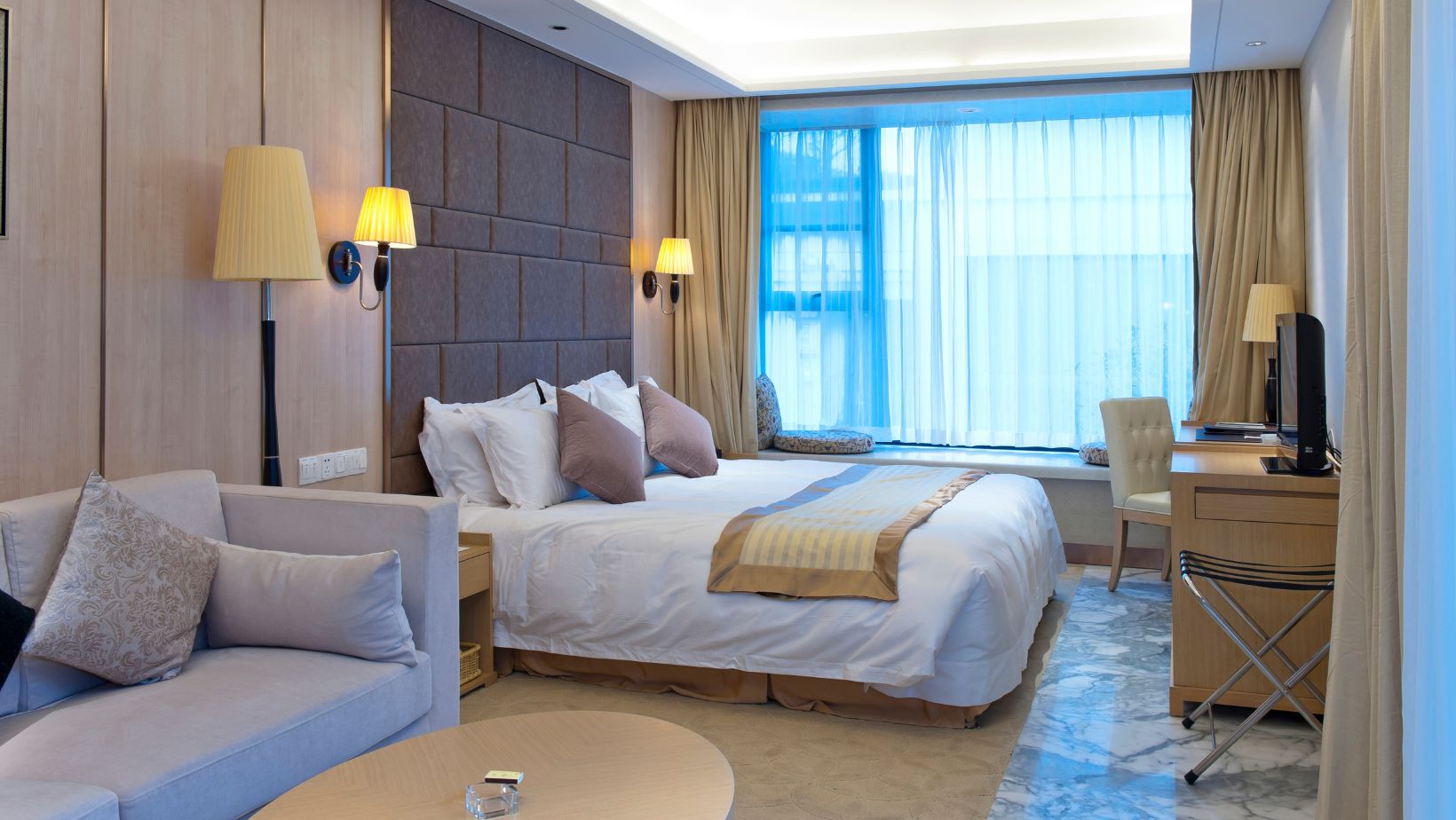
Bedroom colours should prioritize transition and recovery above all else. The psychological wind-down necessary for quality sleep happens more effectively in spaces with low visual stimulation. Rather than choosing completely neutral shades, however, the most effective sleep environments often feature heavily greyed versions of favourite colours. These desaturated tones provide subtle personality while allowing the nervous system to relax progressively throughout the evening hours.
The Unexpected Influence: How Light Sources Transform Colour
Perhaps the most overlooked aspect of colour selection involves understanding how various light sources dramatically transform painted surfaces throughout the day. This dynamic relationship means that walls essentially become different colours as lighting changes.
Natural light variation creates the most significant transformations. North-facing rooms receive cool, bluish light that intensifies grey and blue undertones in any paint colour. This cool illumination can make cream walls appear dingy if they contain significant yellow undertones. Conversely, south-facing rooms receive warm, golden light that intensifies yellow and red undertones, potentially making neutrals appear surprisingly peach or pink during certain hours.
Artificial lighting choices impact colour even more dramatically than natural light. Traditional incandescent bulbs cast yellowish light that warms all colours, while fluorescent lighting emphasizes cool tones and can make warm colours appear muddy or dull. LED lighting varies tremendously depending on colour temperature ratings, with “cool white” LEDs creating significantly different effects than “warm white” options.
Professional house painters understand these interactions and can recommend colours that maintain attractiveness across lighting conditions. This expertise prevents the disappointment of colours that look perfect on a paint chip but surprisingly wrong once applied to actual walls under various lighting conditions.
The Neighbourhood Effect: How Adjacent Colours Change Perception
Colours never exist in isolation within homes. Each shade interacts with flooring, furnishings, and adjacent rooms to create either harmony or discord. Understanding these relationships prevents costly mistakes and disappointed expectations.
Flooring creates the foundation of colour relationships within any room. The undertones in hardwood, tile, or carpet significantly influence how wall colours appear. Red oak flooring with its warm undertones can make cool-leaning neutrals appear drab and lifeless, while the same wall colour paired with cooler ash or maple flooring might look perfectly balanced.
Open-concept homes require particular attention to colour flow between spaces. While rooms don’t need identical colours, transitions work ideal when adjacent spaces share either similar undertones or complementary relationships. Professional house painters often recommend creating small sample areas where rooms connect to evaluate these relationships before committing to full walls.
Exterior views also impact interior colour perception. Rooms overlooking abundant greenery take on subtle reflections of that foliage, particularly when painted in light-reflective shades. Similarly, urban views with predominantly concrete and steel can cast cool, grey reflections that transform interior colours during daylight hours.
Beyond Trends: Selecting Timeless Colours with Staying Power
While design magazines showcase fresh colour trends each season, most homeowners prefer palettes with staying power. Creating this timeless quality requires understanding the difference between truly enduring colours and temporary trends.
Colour saturation often determines longevity more than the actual hue. Highly saturated trendy colours typically create the strongest trend associations and therefore date most quickly. Moderately saturated or slightly greyed versions of these same colours often retain appeal much longer. This explains why certain heritage colours from quality paint lines remain relevant decade after decade.
Regional influences significantly impact colour longevity. Colours that feel timeless in Vancouver with its misty, moderate climate may appear strikingly out of place in the clear light and dramatic seasonal changes of Prairie provinces. Professional house painters familiar with local conditions offer invaluable guidance about regionally appropriate selections that withstand both seasonal changes and passing trends.
Personal colour responses should ultimately override trends entirely. Colours that create positive psychological responses for the actual inhabitants matter far more than current design magazine features. The most successful long-term colour selections connect with both the architecture and the homeowners’ personal colour affinities, creating spaces that feel instinctively right regardless of external trends.
The Application Factor: How Finish and Technique Transform Colour
Even the perfect colour selection can disappoint without appropriate application techniques and finish selection. The final appearance depends not just on the colour itself but on how it interacts with surface texture and light reflection.
Finish selection dramatically impacts both appearance and functionality. Matte finishes minimize surface irregularities but prove difficult to clean, making them problematic for high-traffic areas or homes with young children. Semi-gloss finishes offer excellent durability but amplify every surface imperfection while creating potential glare. Professional house painters evaluate both practical needs and aesthetic goals when recommending appropriate finishes for different spaces and purposes.
Application technique influences final appearance as much as the colour itself. Sprayed application creates the most uniform finish but sacrifices the subtle texture that sometimes adds desirable character. Rolled application provides moderate texture that helps hide minor wall imperfections. Specialized techniques like colour washing or lime finishing can transform even simple colours into distinctive treatments that add exceptional character.
Lighting placement requires coordination with paint selection and finish. Poorly placed lighting creates harsh shadows and uneven illumination that undermines even perfect colour choices. Professional painters often recommend lighting adjustments that showcase colours at their greatest, particularly for spaces where wall colour plays a significant design role.
Conclusion: Colour as a Living Element
The most successful interior colour schemes recognize paint as a living element that changes constantly with light, adjacent elements, and even seasonal shifts. This dynamic quality makes colour selection both challenging and rewarding, with results that continually reveal new aspects as conditions change.
Professional house painters bring not just technical skill but crucial perspective about how colours behave in real environments over time. This expertise helps homeowners navigate beyond temporary trends toward colours that create enduring satisfaction and psychological comfort.
The ultimate success comes not from achieving perfect adherence to design rules but from creating spaces that feel instinctively right to their inhabitants. When colours align with both architectural needs and personal affinities, the result transcends aesthetics to create environments that genuinely enhance daily living. This harmony between space, colour, and inhabitant represents the true measure of successful colour selection.


