Painting for Business: Successful Branding Stories Through Commercial Buildings
Commercial building painting is a powerful branding tool that uses colors to leave a lasting impression.
Colors can shape how customers see a brand. Examples from companies like McDonald’s and Apple show how painting can make a brand recognizable and memorable.
It’s also a way for businesses to convey their values, like Patagonia’s love for nature. Current trends include using bold, attention-grabbing colors and eco-friendly methods.
Businesses should do their homework and hire experts when using commercial building painting as a branding strategy. The Psychology of Color in Branding plays a significant role in this.
The Psychology of Color in Branding
Colors have a big impact on how people feel. Businesses can use specific colors to shape how customers see them. For example, red makes people feel excited and hungry. McDonald’s uses it to match their fast-food image.
Blue is about trust and reliability. Like their high-quality products, Apple uses blue to show they’re calm and dependable.
Green is about nature and being eco-friendly. Patagonia uses green to say they care about the environment.
These examples show how colors can change how customers feel about a business. Companies can make a strong impression on customers by picking the right colors.
Real-Life Branding Stories
Businesses that made their buildings part of their brand. One great example is Starbucks.
They use their green color everywhere in their stores, which makes them feel cozy and eco-friendly. It’s a big part of why people love going there.
Another remarkable story is the Empire State Building in New York. They turned it all red for Valentine’s Day with a chocolate brand. It was a way to show love and got lots of people talking about it on social media.
And in Spain, the Guggenheim Museum looks amazing. It’s silver and super futuristic. This cool design is all about showing they’re modern and into new art. It makes lots of people want to visit and see cool art.
These stories show how painting a building can make a brand stand out. Whether it’s about a cozy feeling, love, or being modern, it’s a big deal for businesses.
Creating a Visual Identity
How painting a business’s building can make it memorable. For example, Nike’s stores look modern and sporty with their famous Swoosh logo.
They’re saying, “We’re all about innovation and sports!” It gets the attention of athletes and sports fans.
Another story is The Body Shop. They’re all about being eco-friendly. So, their stores are painted in earthy colors like green and brown and use natural materials like wood and bamboo.
This shows they care about nature and are ethical.
Both these stories show that painting a building correctly can tell customers what a brand is all about.
It makes a brand stand out and makes customers remember it.
Brand Recognition and Recall
A well-painted building can make people remember a brand better. When businesses choose colors, designs, and finishes that match their brand, it leaves a strong impression on customers.
Think about The Home Depot, for instance. They use bright orange on their buildings, and you can spot them far away. This color makes you think about home improvement and DIY projects, which The Home Depot is all about. This special paint job helps people recognize and remember The Home Depot.
Then there’s the famous Coca-Cola building in Times Square, New York City. It’s all bright red with the Coca-Cola logo. This unique painting job has made the building a landmark, and when people see it, they instantly think of Coca-Cola.
These examples show how a building is painted can boost brand recognition. When a building’s look matches the brand, it helps businesses stand out and be more memorable to customers.
Values and Messaging Through Painting
Commercial building painting isn’t just about making a building look good; it’s a way for businesses to show what they believe in.
Businesses can make a visual statement about their values and beliefs by picking the right colors and designs.
Take Tesla, for example. They care about the environment and clean energy, so they use shades of green in their buildings.
This shows everyone passing by that they’re into sustainability. People who care about the environment notice this, and it helps Tesla attract those customers.
Then there’s Chipotle, the restaurant chain. They use paint to show their support for local communities and use responsible ingredients.
When you see murals of local farmers and sustainable farming practices on their buildings, it’s clear that they value community and ethical sourcing. People who like these things are more likely to choose Chipotle.
Innovation is another value that can shine through painting. Apple, the tech giant, uses clean lines, neutral colors, and shiny finishes in its store designs.
This gives a sense of forward-thinking and quality. It fits with their image as a leader in the tech world and people who value innovation like what they see.
These examples show that commercial building painting is a powerful way for businesses to share their values and beliefs.
Choosing colors and designs that match what they stand for connects with customers and strengthens their brand. These small details help businesses stand out and connect with the right people.
Trends in Commercial Building Painting
Commercial building painting changes with the times to fit what people like and how things look. To get your brand across, businesses need to know what’s popular. Here are some of the latest trends:
1. Simple and Single Colors:
Recently, people like to keep it simple. Businesses often use one primary color for their buildings. They usually pick calm colors like white, gray, or black. This makes things look modern and smooth, which works well for brands that want to show sophistication.
2. Bright and Bold Colors:
On the other hand, some businesses use bright and solid colors for their buildings. They want people to notice them. They use colors like red, yellow, and blue to stand out. This is good for companies that are creative or want younger customers.
3. Colors from Nature:
More and more businesses are picking colors like the environment. They use earthy colors like green, brown, and beige. It shows they care about nature. It’s good for brands that want to look eco-friendly.
4. Textures on the Walls:
Some businesses are trying different textures on their buildings. Instead of just being smooth, the walls have matte, shiny, or bumpy finishes.
It gives a different feeling when you touch it and helps the building look unique.
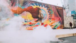
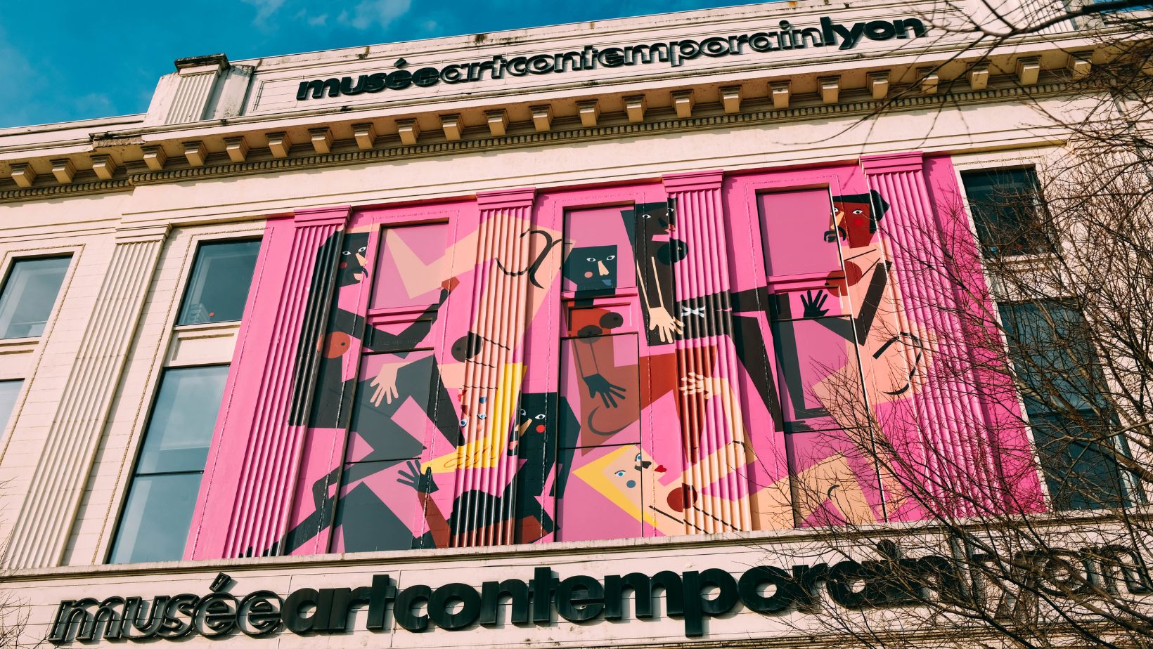
5. Special Pictures and Art:
Many companies are getting artists to paint special pictures of their buildings. These pictures help businesses look different and get their message across. They create a unique experience for customers.
Sustainability and Environmental Considerations
Businesses are thinking more about the environment when they paint their buildings. They use paints that don’t have bad chemicals, paint that’s been used before, or paint that’s made from natural things. It’s better for the planet and shows customers they care.
Case Studies
To help understand better, we’ll look at some examples of businesses that used painting for branding:
- Airbnb: Airbnb is a company that lets people find places to stay when they travel. They painted a big picture on their building that shows they care about different people and everyone being together.
- Starbucks: Starbucks is a famous coffee company. They use green and white for their buildings. This helps people know they’re eco-friendly, making their stores look the same worldwide.
Tips for Businesses
If a business wants to use painting to help with branding, they should:
- Know Your Brand: First, think about what your brand is all about. What do you care about? Who are your customers? This will help you know what colors and designs to use.
- Hire Pros: Painting a building can be challenging. Get people who know what they’re doing. They’ll make sure the work is good.
- Stay Up-to-Date: Learn about what’s new in painting. Try different colors and designs to see what works best for your brand.
- Be Green: Think about the planet. Use paint that’s good for the air and doesn’t make people sick.
- Make It Special: Try to make your building different from others. Use pictures or art to show your brand’s message.
- Keep It the Same: Make sure your building looks like your brand. Use the same colors and designs everywhere.
- Make It High-Quality: Good painting looks better and lasts longer. That means you only need to paint your building some of the time.
- Get the Community Involved: Consider the people living near your building. What do they like? You can do things that make them happy. This builds a good relationship.
Conclusion
By following these tips and looking at the latest trends in commercial building painting, businesses can use this tool to strengthen their brand and make a good impression on customers.